B-Wallet
Category
UI/UX, Fintech, Digital Payment, Visual Design
Responsibility
UI Design Design System Project Management
Tools
Figma Google Meet
Date
Nov 2021
In this financial technology age, digital payment applications has become an integral part of our lives. As companies innovate in the fintech space, user experiences in the financial technology are advancing, encompassing both technical and design advancement. As an enthusiast in this field, my friend and I are seizing this moment by offering a UI Library Kit for digital payment app, catering to those eager to make their mark in fintech innovation.
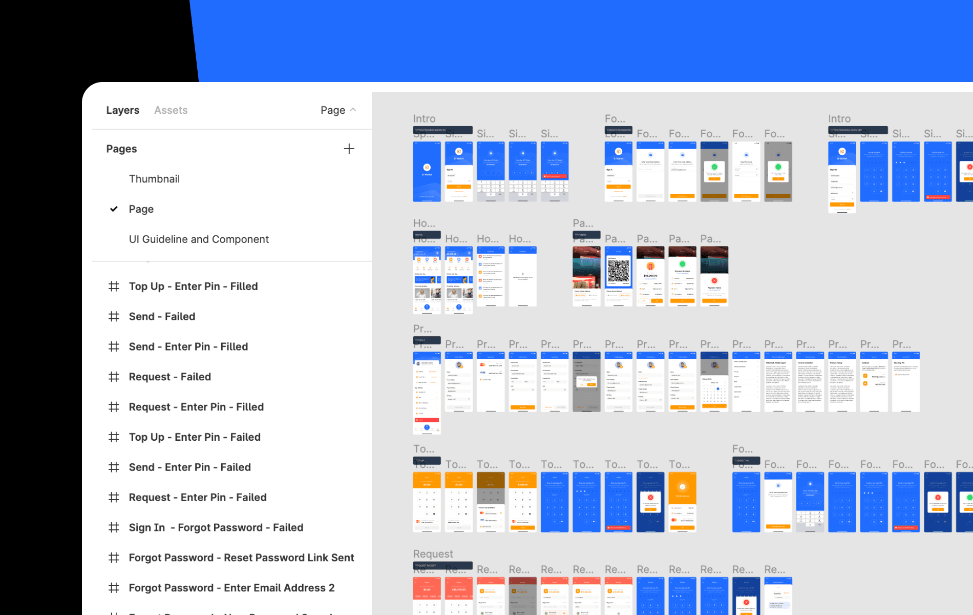
We started the design process by breaking down the feature scopes. We define the scope based on the most frequently used feature of a digital payment app based on our daily experience. Here’s the scope breakdown for this app design:
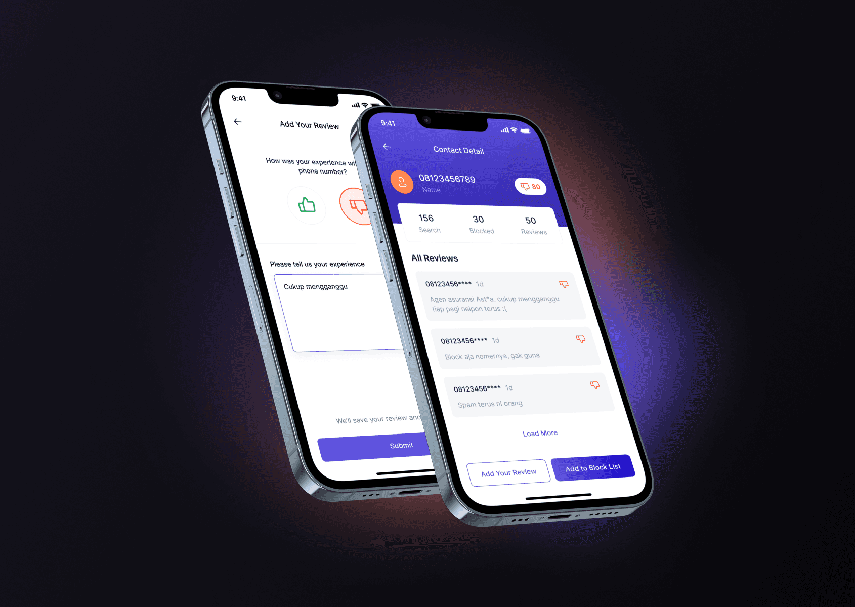
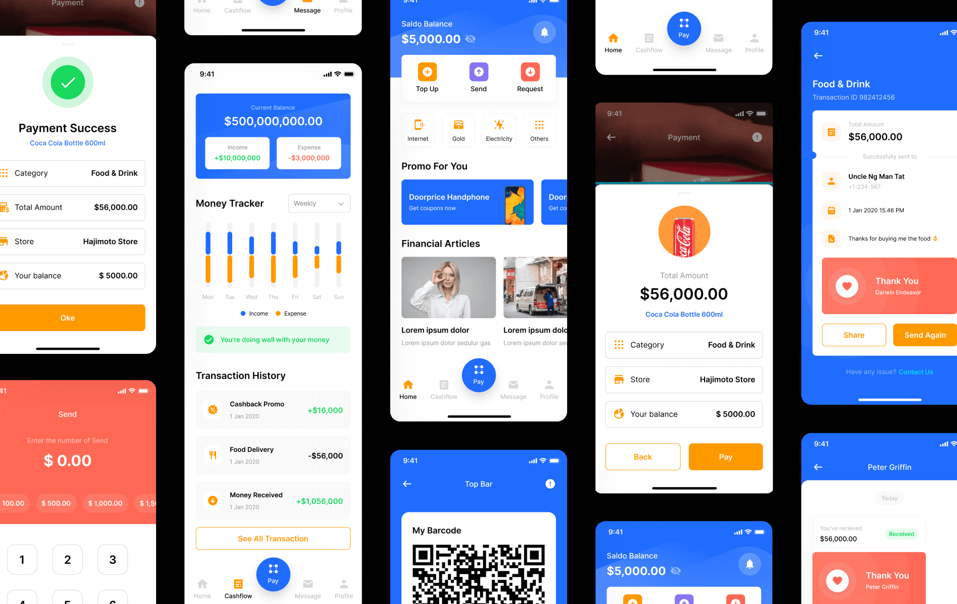
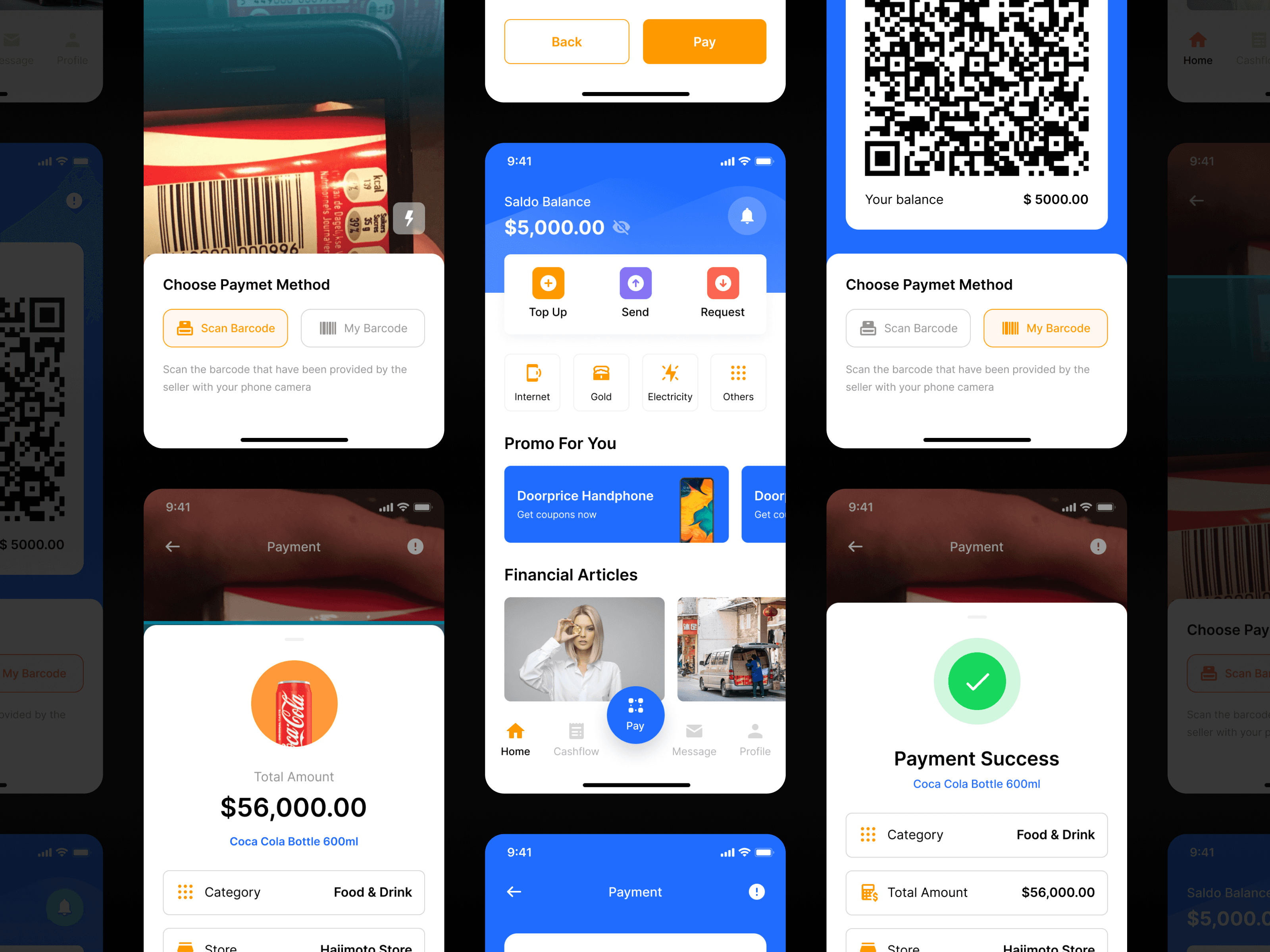
It’s a common thing in Indonesia to pay/transfer money by using QR code scan. We put a QR scan as a main action button in our bottom navigation, so whenever the users need to pay, they can find this button quickly.
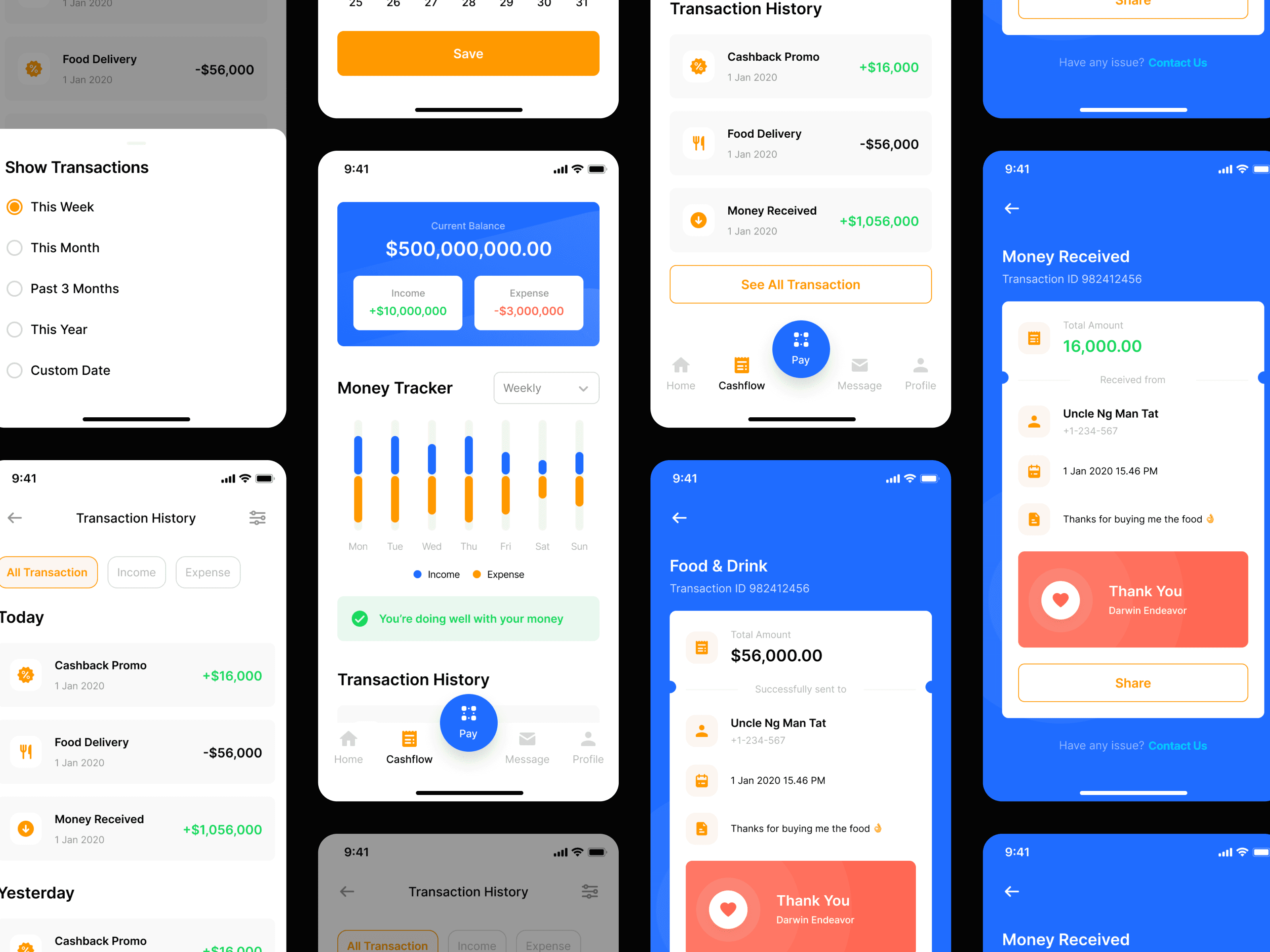
Say no more to share transfer receipt. Whenever a transaction between the users happens, we’ll send them a notification through our chat feature. Now transferring money is as simple as chatting your friend.

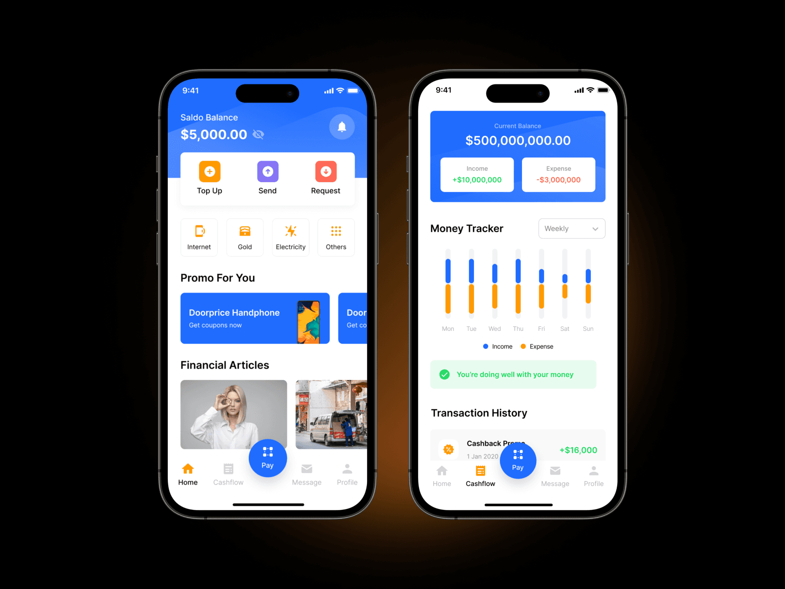
All of the transaction will be generated into a periodically report. There'll be a graphic showing how their income and expense performs and with a simple financial recap, now people can be more mindful to manage their money.
This is my first time building a UI Kit for people. Overall we only took a week to build the entire screens, including a simple version of UI components in Figma. We’ve published it to the design marketplace, but unfortunately there’s still room need to be improved. This project has taught me some valuable lessons like: 1. Scoping Down Your Project into the Most Matter Feature is Important We didn’t design a real project, so basically we don’t need to waste our time on designing less important features for this app (like setting menu, forgot password and everything which isn’t related to our main features). We should prioritize what’s the basic feature that we need the most. 2. Keep Attention to Detail Since we create a design library to others, we need to make it usable to them. Based on the feedback from other designers, they found it harder to use it because the layer management is a bit messy and un-named. We also realized that our Figma component wasn’t well structured at first, because it didn’t optimize the use of variant component. Therefore, we fixed this issue before we upload it into the marketplace.
Special thanks to Habib Al-Hakim for collaborating with me in designing this UI Kit. Also thanks to Mas Yoki for providing feedback for this design.
You can check and download this UI kit on UI8. It's totally FREE!
Need more detail?
This article is just an overview of a design project case study. In case you're craving for more details or there's something you want to discuss, please contact me :)
Next Project